UI | Elevating Trip.com’s app to web experience via Design System
In this case study, our team focuses on developing a design system for Trip.com. By leveraging UX methodologies, we aim to identify key design opportunities and elevate the overall user experience within a 7-week timeframe.
Overview
Trip.com is an international one-stop travel service provider that offers booking services in 24 languages and across 39 countries for a wide range of travel needs.
With a vision to be your “Non-stop Travel Mate,” the company offers all its services through its website and mobile app. More than 50% of their users are millennials between the ages of 25 and 44.
Based on our research, we created a context scenario that demonstrates how the persona would engage with Trip.com’s products.
From the scenarios, we uncovered key user expectations, including:
Access to a wide range of options
Ability to share and discuss findings
Seamless transition between digital platforms
Effortless resumption from where they last left off
Next, we mapped the persona's journey toward booking the best option on the website and identified two key stages where user satisfaction dropped.
We also reviewed each step screen by screen to better understand and empathize with what users experience when booking their travel needs.
Issues
Upon conducting a heuristics evaluation, we found that the consistency & standards heuristic has the most violations. We identified 3 key elements that has this issue:
Navigation
Widgets
Cards
Examples of these inconsistencies
Beyond inconsistencies in the elements, the contents and structure of the same cards differ in app and web as well.
Based on these findings, we defined our problem statement:
How might we create a seamless & intuitive app to web experience so that users feel empowered in their travel exploration with Trip?
Opportunities
From our research, we identified 2 key opportunities.
Given the multitude of elements in Trip.com's digital products, a consistent and adaptable design system would ensure visual coherence across both the app and the web.
Because of Trip.com's complex and layered offerings, adopting a straightforward and intuitive approach could enhance the user experience across their digital products.
Solutions
We began by defining our design principles through a process of keywording, voting, and mind mapping. The final set of principles is presented below.
Next, we expanded Trip.com’s existing brand colour palette for their digital product.
Trip.com's existing brand guideline colour palette
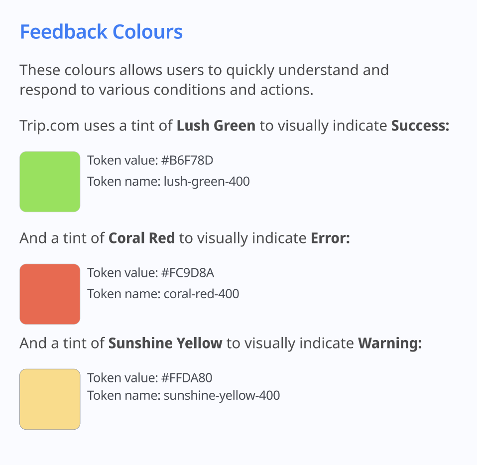
We also assigned specific roles to selected colours.
We moved on to typography, selecting Noto Sans from Trip's brand guidelines for its functional design, versatility, and broad range of language variants.
For spacings and grid, we kept to 4-point grid system.
For mobile
For web
Afterwards, we streamlined Trip’s myriad of different icons and defined two styles that would unmistakably be identified with Trip.com. They are available in reverse colour as well.
Branded Icons in Trip Colours and Omni Circle
Functional Icons in a Trip Blue Outline Strokes
Components
Navigation
We streamlined search navigation across both app and web platforms, utilising the same icon style for product offerings to deliver a cohesive visual experience.
Widgets
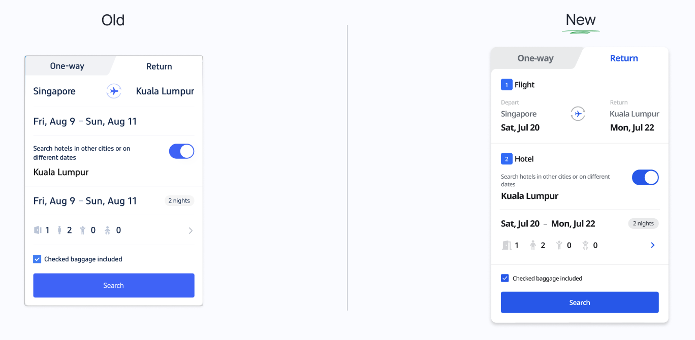
Flights and hotels were clearly labeled, accompanied by a sequential UI designed to guide users effortlessly through their journey.
For app
We standardized UI elements, such as buttons and widths, and ensured consistent layout alignment across the platform.
For web
Filters
We improved the consistency between the app and web interfaces.
Buttons
Padding, width, and margin were standardised for a cohesive design.
Cards
The cards present information in a standardized and consistent manner throughout all product offerings.
Chips
Chips are colour-coded and come in two states to ensure visual hierachy:
Primary (with a solid background)
Secondary (with a light background)
Prototype
Home page & Widget
Search Result Page
View the design system here:
Disclaimer: This is a school project completed by a team of 3.


