UX/UI | Fostering Healthy Habits and Mindsets with Healthy 365 Part 2
This is the last part of a two-part project, which will focus on Structure, Skeleton, and Surface.
Design Challenge
Our team is now tasked with presenting a high-fidelity prototype after receiving stakeholder approval to move forward with design efforts. This prototype will allow stakeholders to provide feedback, ensuring alignment with product objectives and user needs. Additionally, it will assist development teams in identifying potential issues and opportunities early in the development process.
Recap
Following the release plan, we aligned the proposed features with the new user journey, helping stakeholders visualize their seamless integration into the user's life.
Brand & Styles
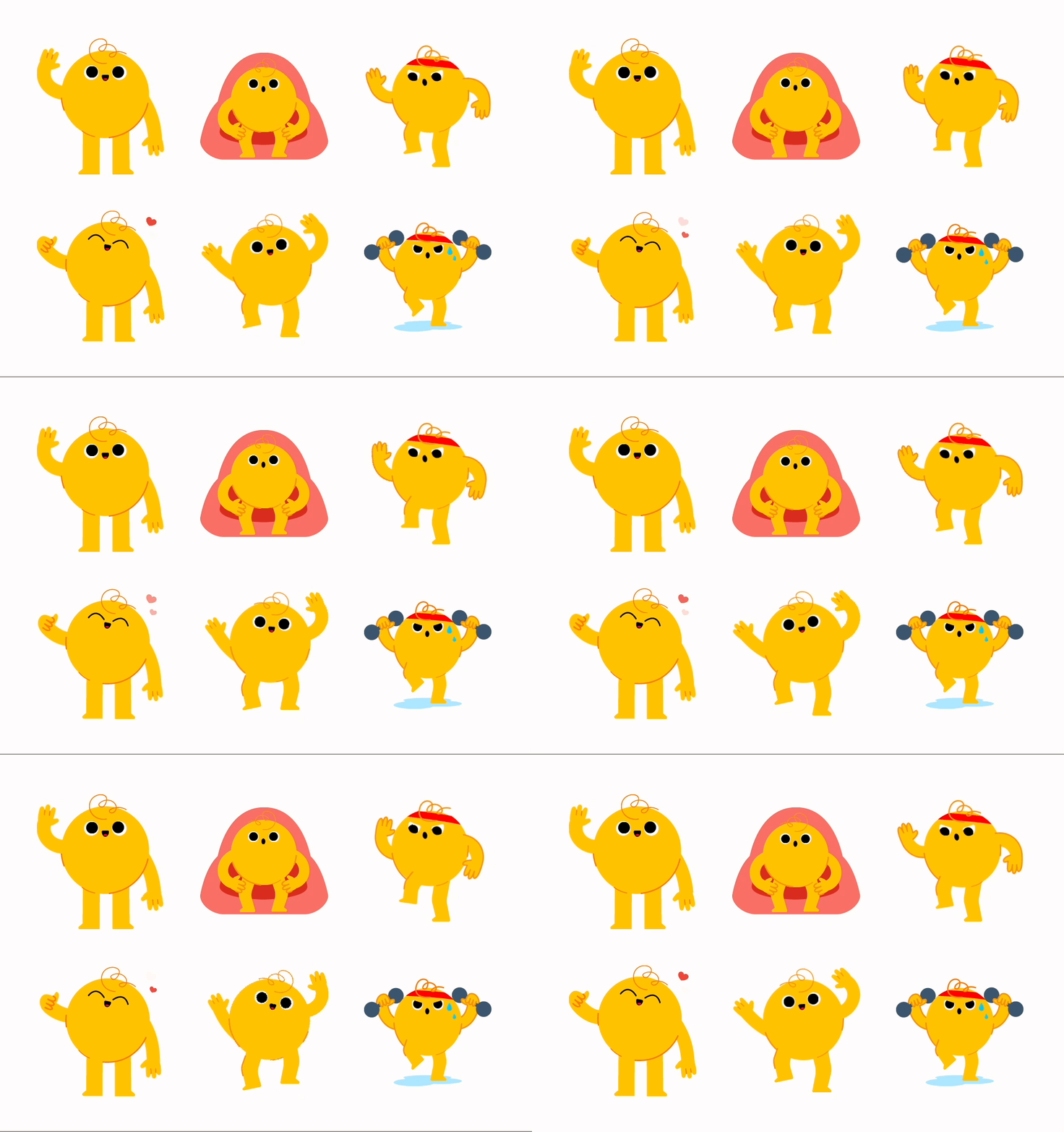
We introduced a character named Glow as the app’s mascot. Glow serves as a personal health companion, guiding users on their journey toward adopting a healthier lifestyle. Glow will use a friendly and encouraging tone, offering constant support to users as they navigate the app.
We selected a typography and colour palette that enriches the app’s design, along with a unique set of gradients, 365 Time Gradients, to visually depict the app’s continuous journey with users throughout the day.
Information Architecture
To organise the app’s content effectively, we conducted an open card sorting exercise within our target users to determine where each content should be placed.
Healthy 365 app – Before and after
Prototype
Features
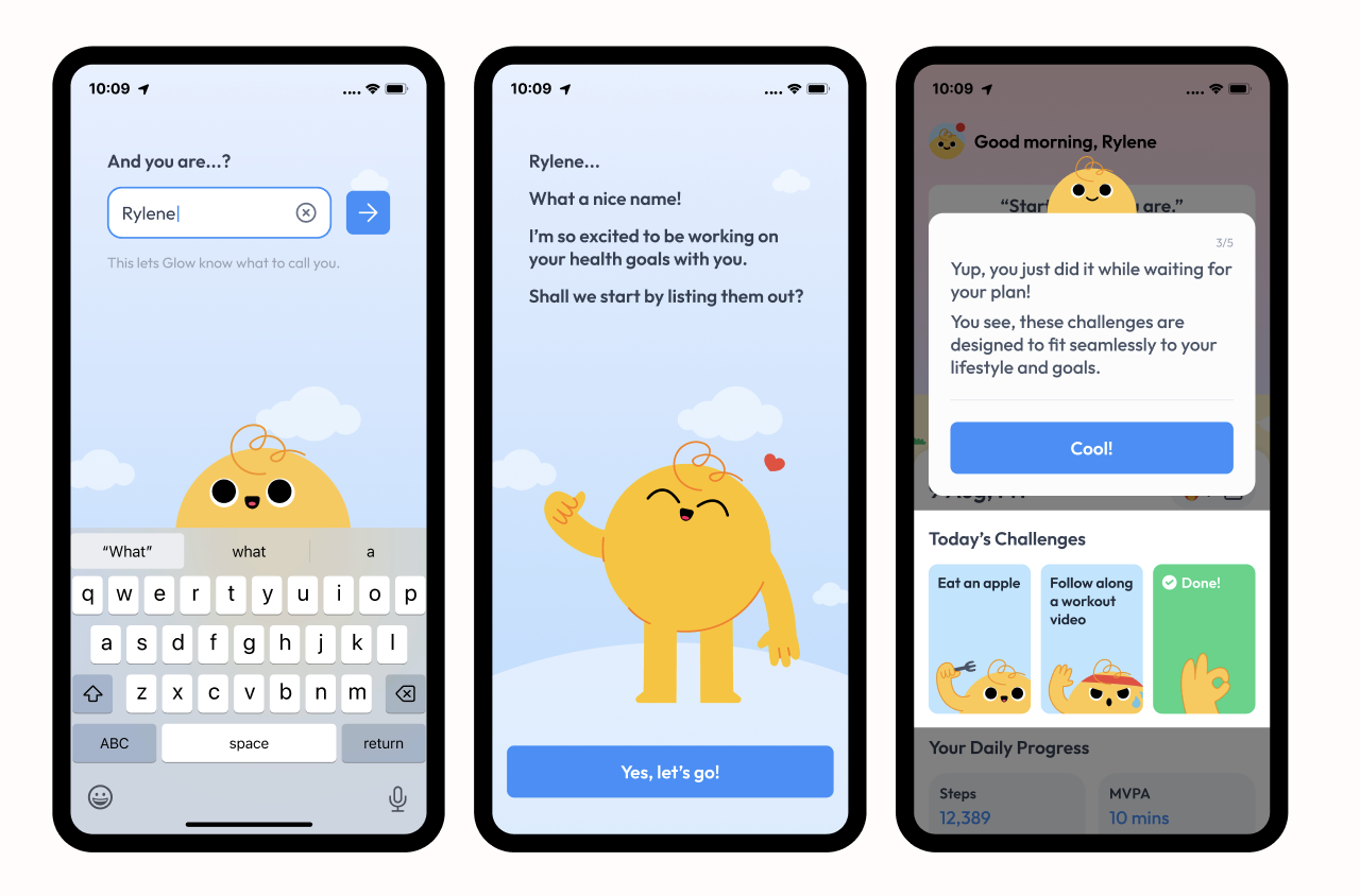
1. Value-Driven Onboarding
Introducing short mindfulness exercises during loading screens and postponing sign-up until after the "aha" moment ensures a stress-free and captivating initial experience.
2. Personalised Onboarding
Providing options to select health goals, indicate activity levels, and choose time commitments ensures that experiences are customized to fit each user’s unique needs and lifestyle.
3. Flexible & Quick Challenges
By allowing users to select custom durations and shuffle challenges, we provide an experience that can be tailored to fit naturally into their daily routines.
4. Visual Progress
Highlighting completed challenges, offering a daily progress overview, and providing a streak calendar make users’ progress more tangible.
5. Motivation Boosters
Notifications and widgets subtly remind and motivate users, helping them maintain streaks with ease.
Streak pauses ensure that missing a day doesn’t lead to discouragement, but allows users to keep going without losing momentum.
Interaction Design
1. Touch-based Gestures
Integrating gestures like swiping and dragging into the form-filling process creates a more engaging and personalized user experience.
2. Personable Animations
Animated mascot made the experience more personable and lighthearted.
3. Tone of Voice
A conversational tone is friendly, approachable, and easy to understand, like chatting with a friend. It uses simple, informal language, making the interaction feel personal and relatable. The goal is to connect with the user, fostering trust and making the experience enjoyable and stress-free.
Sensory
1. Haptics & Sound
Calming ambient sounds help ease users into a state of mindfulness while they wait.
Gentle rhythmic pulses to guide users through the breathing exercise. Slightly stronger vibrations at the end to lightly inform users of completion.
Slight haptic vibration and sound at the end of the timer for time-based challenges.
Slight haptic vibration and sound to celebrate user’s challenge win.
Please view the prototype below:
Next Steps
After the first iteration of the prototype, our next steps are to:
Conduct an usability testing to ensure that designs and interactions are intuitive and identify user needs and areas for improvement before development.
Perform feasibility checks and timeline evaluations to ensure that the proposed features and designs are achievable within a practical timeframe.
Formulate a Go-To-Market Strategy to establish essential messaging, select outreach channels, and plan marketing efforts to maximise the product’s success.
Conclusion
Our main struggle as a team was finding the right balance between the features of the existing Healthy365 app and those of the new app we are proposing. Our research results did not fully align with the current app’s features, likely due to the specific target audience we are focusing on.
Ultimately, we based our decisions on the research conducted, confident that the user experience will improve through future app iterations. We also acknowledge that user needs evolve over time, and there is always room for improvement in this ongoing, iterative process.
Disclaimer: This is a school project done by a team of 4.


