UX | Enhancing Family Experiences at the Zoo with the Mandai App
In this case study, our team seeks to utilize Design Sprint to reassess the usability and user experience of Mandai app’s itinerary feature. Through the application of relevant UX methodologies, we aim to identify significant design opportunities and improve the user experience for families with young children.
Disclaimer: This was a school project, created in collaboration with Mandai Zoo and completed by a team of three.
Introduction
Renowned as one of the world’s leading zoological attractions, the Singapore Zoo annually captivates over 2 million visitors. Its appeal extends to international tourists, wildlife enthusiasts, and local families with young children eager for up-close encounters with animals.
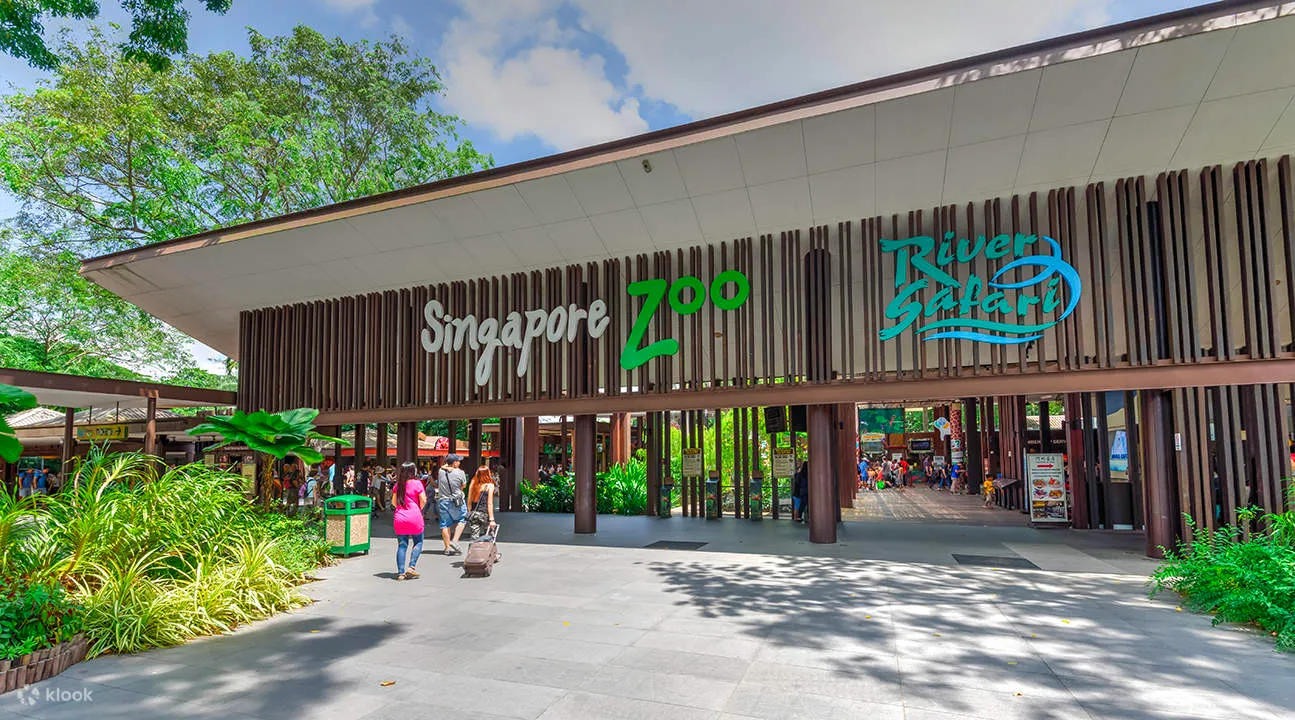
Image of Singapore Zoo taken from Klook
The 26-hectares attraction has more than 4,200 animals of over 300 species, of which 34 per cent are threatened.
Statistics from Mandai Website on Singapore Zoo
Background
Mandai has a mobile application that serves over 100,000 users. It allows visitors to discover things to do, navigate around the zoo with the map feature, set reminders to shows such as presentations and keeper talks, as well as explore recommended half day and full day itinerary guides.
We first dived deep into a desktop research to understand the pain points of users through Google and Klook Reviews from the last 6 months to understand how we could use the app to meet the users needs, address their frustrations, and enhance their overall experience.
A Google review from a local visitor
We identified 3 common patterns of frustrations:
Frustration from long queues and wait times especially for transportation (Shuttle Buses, Tram rides, Taxi) and F&B outlets
Confusion in wayfinding around the zoo, as well as disappointment due to the lack of chanced upon activities.
Displeasure due to the lack of timely updates and alternatives when there are on-ground circumstances such as delays or cancelled programmes due bad weather or maintenance works.
Consolidated findings of reviews of Singapore Zoo on Google and Klook
With a diverse range of activities on offer, the question arises: How can we help visitors optimise their experience at the Singapore Zoo?
Our objective is to design a dynamic itinerary planner that utilizes Mandai’s current experiences and amenities throughout various stages of the visitor journey at Singapore Zoo.
Methodology
We adopted the Design Sprint Methodology — Map, Sketch, Decide, Prototype and Test. Through a 7-week period, we crafted ideas, shortlisted them, built a prototype and tested them with our target audience before re-iterating them. Let’s dive into it!
Design Sprint Methodology
Phase 1: Map
We first had an Ask The Expert Interview session with the Mandai Team and asked several questions:
Who are the current users, and who would be the ideal target audience?
Who are the key competitors?
What does success look like?
What are the current pain points?
What are the long term goals?
All throughout the session, we wrote down notes in the form of How-Might-We questions.
How-Might-We notes from Ask the Expert session
From the session, we identified 3 key objectives:
To ease research frustration by providing information that helps in decision-making, trip preparation and managing time expectations
To facilitate wayfinding by offering information for essential needs, and programmes
To manage expectations due to weather and operational changes by providing info within reasonable time.
With that, we developed a series of Long Term Goals and voted among our team, with the decider having the final vote.
Long Term Goals
We then went on-ground to conduct research at the Singapore Zoo and found that the large majority of the visitors were local families with young children. We focused on these visitor profiles as we furthered our research.
These were the two research methods our team adopted:
Firstly, the Fly-on-the-wall observation — We shadowed several families and observed their behaviour and routes.
Through our observations, we found that visitor parents who were travelling with children move around the zoo very slowly, with very frequent pit stops. We also overheard a family commenting that they would not be able to cover everything with the kids in one day.
Observations from on-ground shadowing in the Singapore Zoo
Secondly, Interviews — We collected feedback on current amenities and experiences to gauge visitor preferences, motivations, and challenges.
Shadowing of a family with 1 child
Most visitor parents we spoke to did not plan for the trip but went around freely and figured things out while they were there. One of the parents elaborated that there’s no point planning in detail when travelling with children because the plans will definitely change.
Feedback from on-ground interviews with visitors
Through the Ask the Expert sessions, on-ground observations, and interviews, we gathered 4 key insights that informed our ideation in the following phases:
1. Visitors are unaware of the app & functions
Visitors find a map useful for navigating around the zoo but do not use the app’s map because they are unaware of the app and its functions.
“Oh they have an app? I think maybe I saw it on the website, but i’m not sure.”
2. Visitors concerned about giving out personal details
Visitors don’t download the app because they assume personal details must be provided and prefer not to give it.
“Not sure what it does, and usually need to give personal info which i dont want to.”
3. Plans often keep changing when travelling with kids
Parents don’t use an itinerary and don’t follow through with a plan because going out with kids is unpredictable and plans are tailored to how the kids feel. (e.g. spontaneous lunch/snack/toilet/air-con breaks)
“I’m not a planner, we prefer to just go around freely. With kids its hard to plan too. Anything can happen at any time. If they are tired and hungry, our plans change on the spot. And with 3 kids to take care of, where got time to take out phone, plan itinerary on phone. Maybe when my kids are older we can.”
3 different families resting at a shelter
Family stopping for a break to feed the young children
4. Parents want to have quality time with children
Parents are not interested in trying the app because they do not want to be constantly on their phones and want to be physically and mentally present and spend quality time with their children at the zoo.
“I try not to use my phone while I’m out with my children. I want to give them my full attention and have fun together.”
Based on our findings, we developed some potential sprint questions on what we could focus on in this sprint and eventually voted on one.
Sprint Questions
Our team then mapped out the visitor journey and developed more How-Might-We notes to identify the opportunities through the entire visitor’s journey. We then combined it with the set of notes from the Ask the Expert session.
How-Might-We notes before re-organising
To identify where these opportunities might fall into the visitor journey map, we reorganised them into different themes, voted on them with dots with the selected Sprint Question in mind.
Consolidated and re-organised How-Might-We notes
After which, we plotted them accordingly into the Visitor Journey Map.
Selected How-Might-We notes plotted into our Visitor Journey Map
Phase 2: Sketch
Through Lightning Demos, we drew inspiration from established solutions in zoos like Taronga Zoo and San Diego Zoo, iconic destinations like Disneyland, and planning platforms such as LUMA. We then identified some valuable components to innovate within our unique context.
Lightning demo process
Each of our team members proceeded to develop a solution sketch, showcasing our ideas anonymously within the limitations of three A4 papers.
Our Solution Sketch showcasing each of our ideas
Phase 3: Decide
We utilized dot voting to create a heatmap, highlighting the features we favored and deemed appropriate for our final solution.
Creating a heatmap on our Solution Sketches
We shortlisted 6 ideas based on our objectives and findings across the ‘Map’ phase.
1. Pre-visit Communications:
To raise awareness about the app and its value.
Promotion SMS with GIF animation illustrating the uses of itinerary planner
2. App Onboarding:
To guide the users on how to use the app.
Step-by-step instructions for onboarding
3. Personalised & Customisable Itinerary:
To tailor plans to meet each user’s unique needs.
Personalised & Customisable Itinerary
4. Itinerary in a Map route view and Special Routes Toggle:
To give users visibility of their day’s plan visually, and give alternative route options for users with wheelchairs or strollers, or in preparation for wet weather navigation.
Itinerary in Map Route View & Special Routes
5. Personalised Notifications:
To give users timely and relevant updates.
Personalised Notifications
6. Digital Stamp Quest:
To allow users to experience bite-sized adventures and gamify the zoo experience with an education quest children can take part in.
Digital Stamp Quests
We then developed a storyboard that helps us visualise the overall user experience based on these features before proceeding to prototyping.
Storyboard
Now, let’s explore the prototypes for each idea!
Phase 4: Prototype
1. E-ticket Email
Since visitors receive their e-tickets via email, we propose redesigning the Email Booking Confirmation to incorporate promotional content about the mobile app. This will raise awareness and demonstrate the value it brings to visitors through visual illustrations.
The email includes:
Email Confirmation with Ticket QR Code
Recommended Itinerary Based on Tickets Purchased
Prompt to Download App for Enhanced Experience: Using visuals to showcase the features such as itinerary customisation, advanced wayfinding capabilities, and personalised notifications to encourage users to download the app.
Prototype of Email Confirmation
2. Promotional SMS
Next, we crafted a SMS to be sent two days before the visitors’ upcoming trip, providing a timely prompt and encouraging them to download the app. This SMS includes visuals in GIF format to illustrate the app’s features, helping visitors envision the value the app can bring to their upcoming zoo experience.
Promotional SMS with GIF animation to illustrate app’s features
3. Onboarding
After downloading the app, visitors will be guided with a simple Onboarding that highlights key functions and features, aiding users in understanding how to use the app effectively. This guided experience ensures a positive user journey, ultimately leading to increased app usage and an optimized zoo trip for users.
Prototype of the Onboarding feature
4. Personalised & Customisable Itinerary
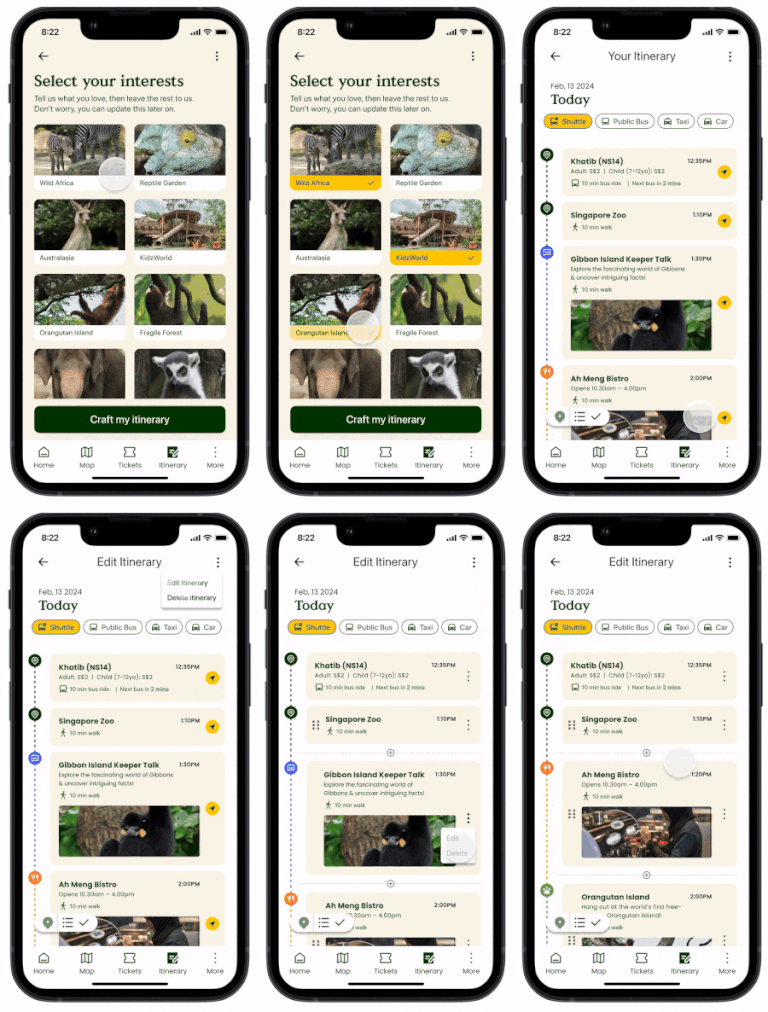
As everyone has different interests, this Personalized Itinerary feature empowers visitors to select their preferences and receive a recommended itinerary tailored to their interests. It also recommends the best routes, factoring in fixed presentation and keeper talk timings, enabling users to optimize their time in the zoo.
Parents also shared their concerns on traveling with children.
“With kids its hard to plan too. Anything can happen at any time. If they are tired and hungry, our plans change on the spot.”
This Customisable Itinerary is designed to adapt to the evolving needs of our users throughout the day — allowing users to conveniently and easily edit the itinerary anytime at their fingertips.
Prototype of the Personalised & Customisable Itinerary
5. Itinerary in Map Route View
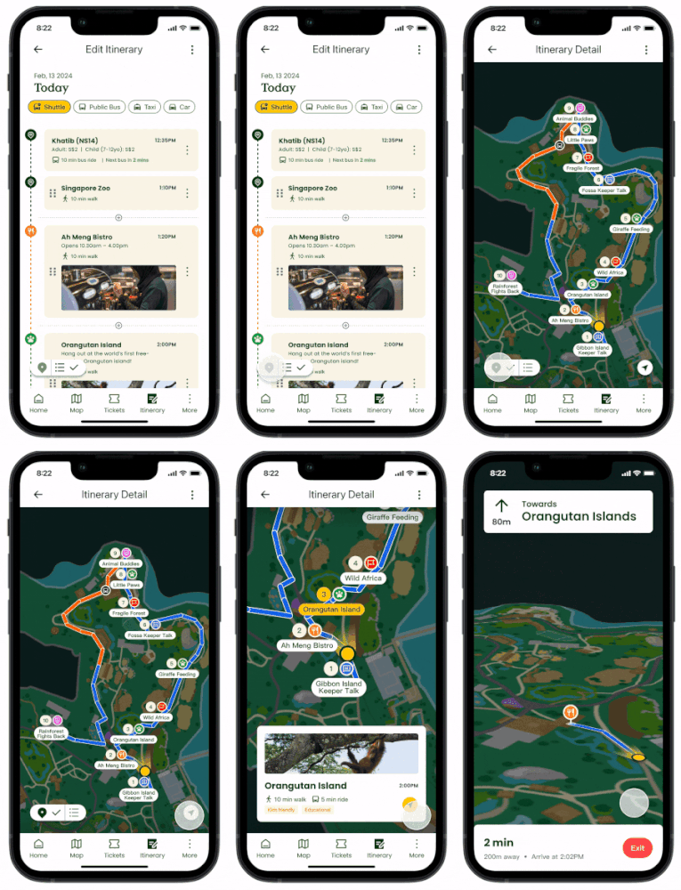
During our observation, we noticed a family attempting to track their progress on the map. This led us to understand that some visitors prefer having their itinerary displayed on the map for visual reference rather than a list view. Placing the itinerary in the context of the map allows users to visualize their route around the zoo more effectively.
Prototype of the Itinerary in the Map Route View
6. Special Routes Toggle
During our on-ground research trip, we noticed that a large number of visitors were parents with strollers. Additionally, there is a considerable number of negative experiences documented in Google and Klook reviews were attributed to adverse weather conditions, leaving visitors stranded. This Special Routes Toggle allows users to activate specific routes based on their needs.
Prototype of the Special Routes Toggle
7. Personalised Notifications
One of our key insights was that parents are not interested in trying the Mandai app because they do not want to keep using their phones and prefer to be physically and mentally present to spend quality time with their children at the zoo.
The Personalized Notifications feature ensure that users receive only relevant updates and reminders tailored to their needs. This includes important live announcements about delays or cancellations of activities due to adverse weather conditions or maintenance issues. Additionally, the feature helps minimise disappointment by providing alternatives.
Prototype of the Personalised Notifications Function
8. Educational In-App Break Time Game
To support the parents we also introduced an Educational In-App Break Time Game that children can play while the parents dine to learn more about the animals in the zoo in a fun and engaging way. Parents would receive a notification when their location is detected to be in sheltered rest stops or at F&B locations, presumably having a meal time break.
Prototype of the Educational In-App Break Break Time Games
9. Mini Adventures
Finally, based on our insights, we discovered that parents often don’t use an itinerary and don’t stick to a plan due to the unpredictable nature of outings with children. Plans frequently change based on the children’s moods.
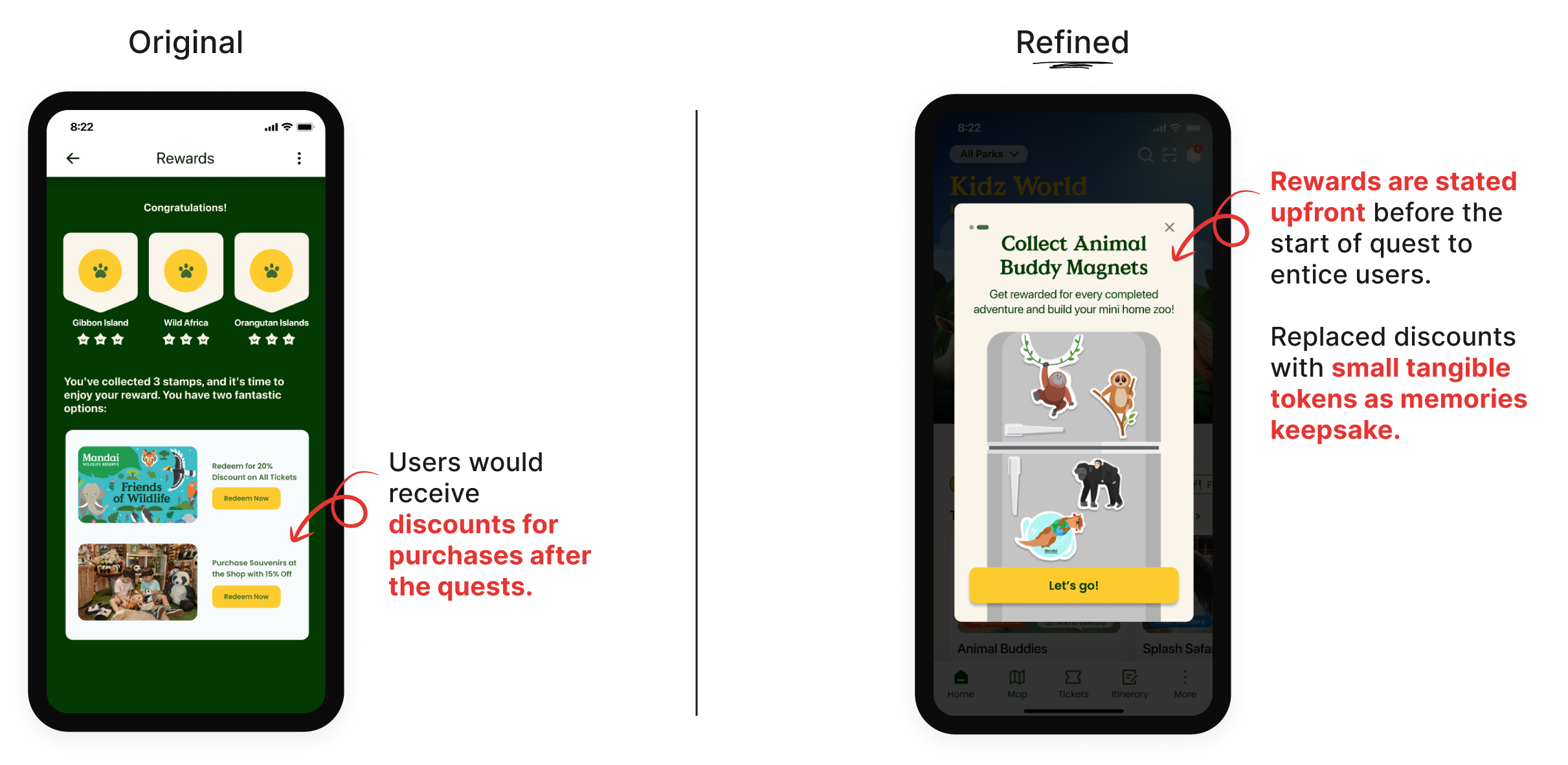
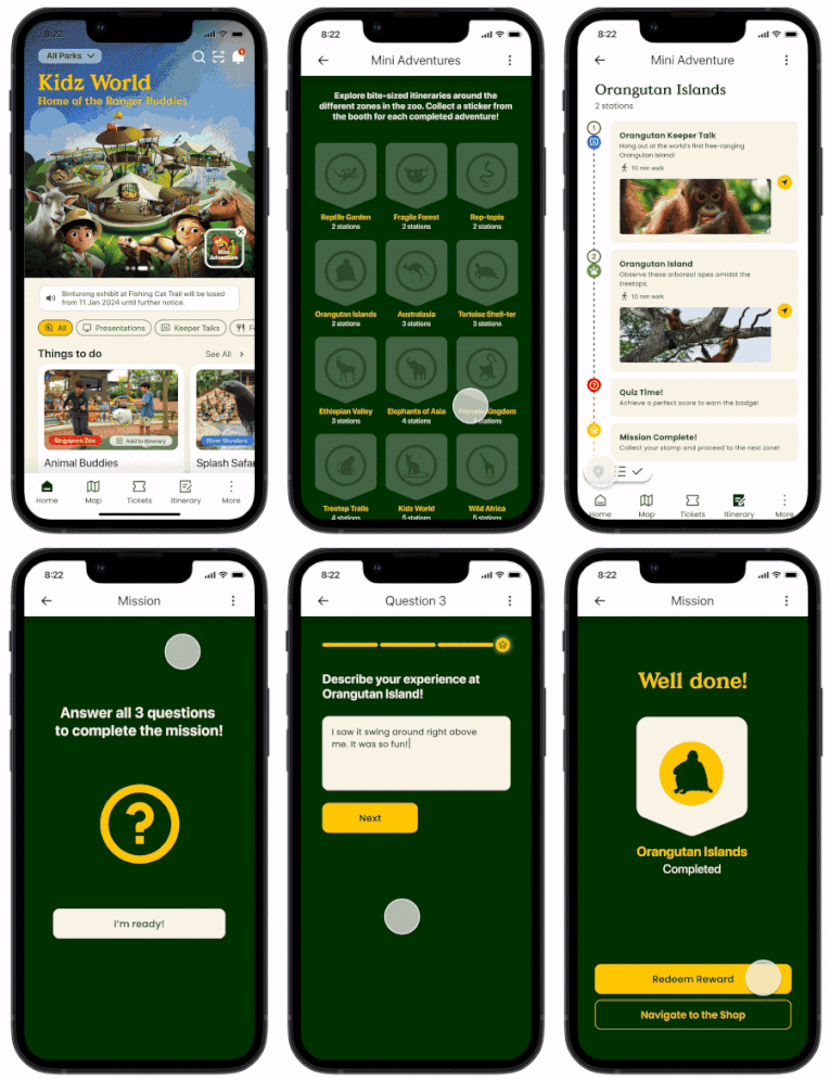
To address this, we introduced Mini Adventures that gamify the zoo experience with quests in various zones. Collecting badges encourages exploration of different zones and helps users track their progress in the zoo. This feature enhances the experience for repeated visitors like Friends of Wildlife members by consistently engaging them in fun, educational, and rewarding experiences within the zoo.
Prototype of the Mini Adventure Quest Feature
Phase 5: Test
Now that our prototypes were ready, we test them!
We came up with 3 scenarios, each with their own set of tasks, to cover the range of features we have implemented in the solutions. These scenarios were designed for our users to test and provide feedback on.
Test scenarios and tasks
Based on our targeted user profiles, we conducted prototype testing remotely with 5 local parents of children aged between 1 and 10 years old. This group comprised of both single-child and multiple-child families.
Our testers
A glimpse of our testing process
We recorded our observations and their feedback using the Rose, Thorn, Bud method as it allow us identify successes, opportunities, and challenges that the testers experienced with our prototype.
Usability testing notes from one of our sessions
Below are some of the feedback received during the test sessions:
The Roses (Successes)
Several testers expressed that they found the Personalised and Customisable Itinerary feature and the Notification functions to be useful. They appreciated the provision of alternative options during on-ground updates such as weather circumstances. Additionally, parents shared that the Mini Adventures helped reinforce learning in the zoo, and the rewards served as great motivators for them to try it out.
The Thorns (Challenges)
Majority of the thorns were related to UI and copywriting. One of it was that the Edit icon wasn’t intuitive for the users. For the Educational In-App Break Time Game, 4 out of 5 users were concerned about screen time for their young children. There was also interesting feedback regarding discounts offered as rewards for completing the Mini Adventures. The parent felt that there is added pressure to spend money in order to fulfil the reward for their children after they have completed the quest.
The Buds (Opportunities)
We then converted the thorns into opportunities and incorporated them along with other suggestions provided by the testers.
Refinements
With the validations and feedback from our testers, we proceeded to refine our prototypes.
Refinement 1: Update ‘Edit’ Icon based on users’ intuitive behavior
Refinement 2: Simplify UX copy
Refinement 3: Make notifications more functional and less ad-like.
Refinement 4: Reposition and design On-ground Live Updates to stand out
Refinement 5: Add Physical Activities as Alternatives
Refinement 6: Change Rewards to Tangible Items
Refinement 7: Improve UI for stamp library
Final Prototypes
1. Improved E-ticket Email
Prototype of Email Confirmation Redesign
2. Promotional SMS
Promotional SMS with GIF animation to illustrate app’s features
3. Onboarding
Preview of Onboarding feature
4. Personalised & Customisable Itinerary
Preview of Itinerary Planner
5. Itinerary in Map Route View
Preview of Map Route View
6. Special Routes Toggle
7. Personalised & Dynamic Notifications
8. Educational In-App Break Time Game
9. Mini Adventures
Preview of Mini Adventure Quests
Reflections
Our struggle as a team was the evident tension between wanting the users to utilize the app, and recognizing that users want time off the screen to spend time with their family in the zoo. The project sought to find that balance to meet the users where they are and support them through their experience at every possible touchpoint with Mandai — pre-, during, and post-visit.
We believe that our app iterations will enhance the overall user experience for visitors at the zoo while recognizing that there is always room for improvement and this will be an iterative journey where the application will continue to evolve to meet the changing needs of our target audience.
