UI | Reimagining the iGV app
Over seven weeks, our team evaluated the iGV app's user interface, identifying pain points, ideating, prototyping, and testing with users. We refined the prototype and sharpened our UI design skills while effectively communicating key design decisions.
Background
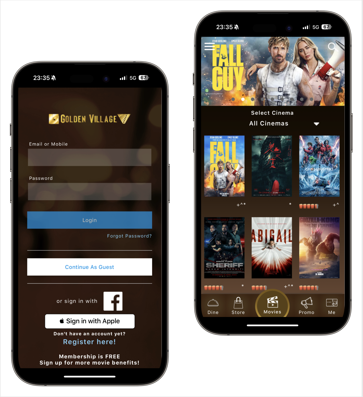
Golden Village (GV), a leading cinema chain in Singapore, operates 15 multiplexes with 120 screens nationwide. To enhance convenience, GV enables users to book movie tickets anytime, anywhere through its app.
Golden Village app (iGV)
Through desktop research and user feedback, we identified several UI-related issues that could be improved to enhance overall usability.
App store reviews from users
While the iGV app includes a wide range of features, our project specifically targets improving the browsing experience.
Pain points – Homescreen
Pain points – Search (Quick Buy & Contextual Search)
Pain points – Movie Info & Seating Selection
Problem Statement
Upon identifying the users pain points, we established a primary problem statement: How might we simplify the movie selection process for iGV app users? We also considered a secondary goal of improving the overall app's navigation. With these challenges in mind, we simplified the user flow within the browsing section.
User flow – Before
User flow – After
Next, we prioritized key opportunities for improvement as listed below:
Browsing
Browsing from “Movies” tab
Movie information
Ratings, movie trailer, genre, classifications (PG13, NC16)
Tooltips for moviegoers to redeem their free ticket, annual pass, or GV Good deals.
Searching
Hamburger menu
Quick search
Using keywords
Filters
By location & date
Checkout Process
Seats selection
Choose seats, display legend, date, time, and location
Step progress indicators + Timer
Display ongoing process status, inform users of the current step, and show the time remaining to complete the purchase.
Solutions
We began by individually sketching potential solutions and voting on the promising features and functions.
We retained the original font, expanded the range of their brand colours, and defined the grid and spacing. Following this, we created a mid-fidelity prototype.
Typography
Colours
Grid and spacing
Usability Testing
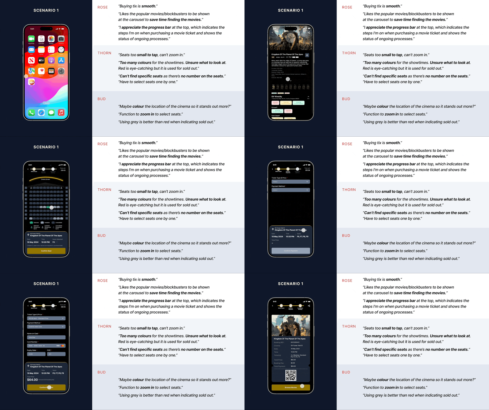
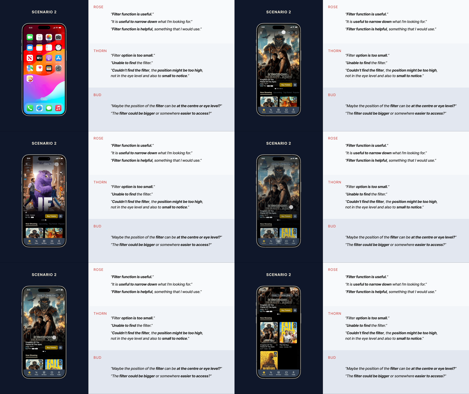
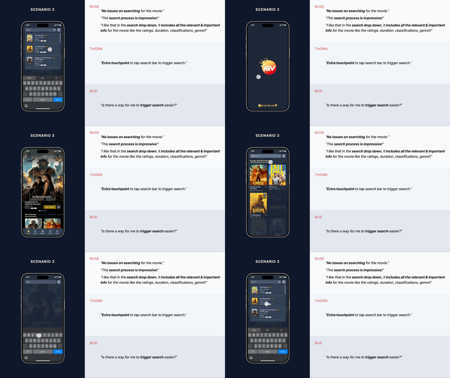
We tested our prototype with three groups of moviegoers—regular, occasional, and rare users. This approach provided a balanced mix of feedback, helping us identify areas for improvement. We recorded our observations and their feedback using the Rose, Thorn, Bud method, which allowed us to pinpoint successes, opportunities, and challenges that the testers encountered with our prototype.
Below are some of the feedback gathered:
Scenario based on browsing via filters
Scenario based on browsing via quick search
Final Prototype
We refined our app based on the feedback collected, leading to our final prototype.
If We Had More Time
Given more time, we would like to explore the following areas:
Seat Selection
Implementing gestures for functions like zooming in and out to simplify seat selection, as well as finding ways to select multiple seats with fewer taps.e-Ticket Accessibility
Simplifying the process of accessing e-tickets for users.Personalized Notifications
Sending reminders for pre-purchased movie sessions, notifications when the cinema hall is ready for entry, and alerts for collecting pre-purchased snacks.
Encourage users to leave ratings and reviews after their movie sessions, and prompt them to purchase tickets for their favorited movies.s.
Reflections
We encountered challenges with building component animations, but we used our How Might We statement to guide and anchor our decisions.
It's crucial to consistently test with users to understand how they navigate through the prototype. This testing ensures that our solution truly addresses user needs and resolves the persistent issues they face.
Every solution should be grounded in user pain points, needs, and frustrations. Otherwise, the research becomes invalid and a wasted effort.
Disclaimer: This is a school project done by a team of 3.


